Generally we find one place appealing and are uneasy in another, most of the time we’re attracted to one product over another. Colour, whether architectural or in products accounts for 60% of our response to an object or a place. When it’s about painting a home, or rather, how to pick the best paint colour for your home, is tricky. Because you’re so confused which one to pick, there’s so many options out there. The solution to this dilemma is, the method, the “ how to” to pick the best paint, not the exact colour though.

In this article, we’ll cover all the aspects it takes to pick the best pain colours for your home, absolutely hassle-free but yet, so sophisticated framework that goes into consideration to make your house feel like a home with the right choice of colours. Without further a do, let’s dive right into colours!
The First Aspect
It’s even more important than your front door and foyer combined in terms of first impressions. Whether you’ve decided on a foundation and shutter combine or just one shade that fits the entire home, we’re here to share some classic favourites to help you decide on the perfect tone for your own home. Think heavily on this, it should show the house’s personality as well as your family’s. And it should be traditional enough to look cozy outside, but unique enough to stand out on the street.
Also Check: How to Pick the Best Paint Colours for Your Home
Chocolatey Brown

Dark enough to stay timeless, but less harsh on the eyes than the favourite black, chocolate brown has a soft, welcoming vibe. It looks great on larger houses and looks even better paired with soft greens and creamy whites for a down-home, natural style.
Sky Blue

It’s cheerful, yet serene and relaxing. Everyone loves blue. It’s reminiscent of the ocean, the sky and balances out emotions for calming effect. It’ll definitely brighten up the neighbourhood.
Creamy Off White
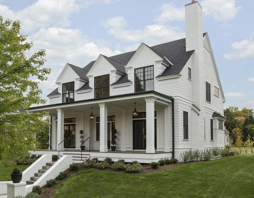
Nix the bright and go with a creamy, sultrier white for the exterior. It meshes well with a variety of shutter shades, from the most unique of hunter greens to the most subtle of camel colours.
Natural Olive Green
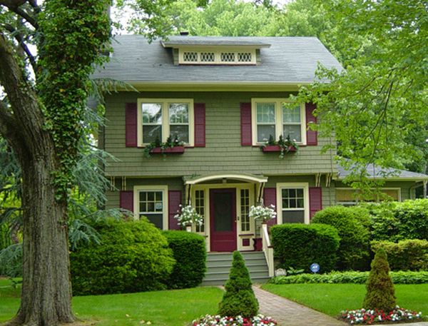
Reminiscent of a crisp, fall day in the forest, these toned-down greens are perfect for making a statement. If you’re torn towards rustic, vintage-inspired spaces, then this may be the perfect pick for the outside of your home.
Hazy Dark Grey
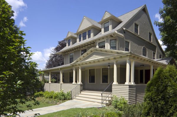
Our favourite neutral tones, is grey. It’s easy, it’s light but still have that mysterious, sexy side that makes everyone feel welcome and excited. It’s a great way to create a foundation that mixes well with any theme too.
Warm Sunny Yellow
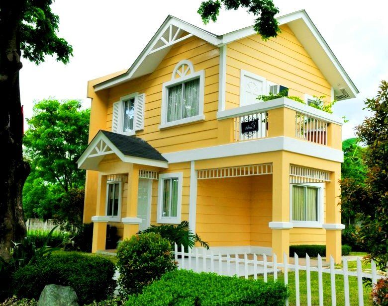
A classic look for the classic family home, yellow makes everyone smile. It may not be the best to dress your bedroom in but it surely shines outside.
Brick Red

Most will only do the trim in a vibrant, brick red, but whatever you decide your house will surely have a fashion-forward, curb-side appeal that no other houses in the neighbourhood will have with such a bold shade.
Also Check: How to Get Rid of White Stains on Brick Walls or Garden Tiles
Midnight Black
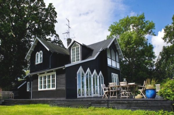
Everyone loves black, it’s the classiest of all colours! And when done right, it’s the most sophisticated way to dress your home. White shutters will add that timeless touch!
Beachy Beige

For a laid-back, relaxed vibe, that’s perfect for beach lovers or those that live near the water, go with something a bit more sandy. It’s upbeat but still makes for a great foundation.
Dark Navy
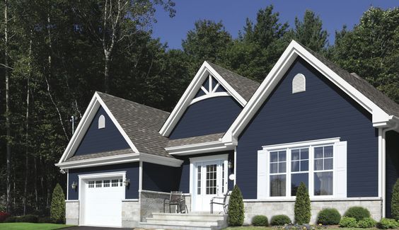
With a bit more punch than a light hazey grey, dark neutral navy speaks to the eclectic in most. Use it on uniquely styled houses for an interesting style.
We hope that these colours do justice to your house! If you wish to learn more about colours, give our paint article a read on colour psychology.

