
Generally we find one place appealing and are uneasy in another, most of the time we’re attracted to one product over another. Colour, whether architectural or in products accounts for 60% of our response to an object or a place. When it’s about painting a home, or rather, how to pick the best paint colour for your home, is tricky. Because you’re so confused which one to pick, there’s so many options out there. The solution to this dilemma is, the method, the “ how to” to pick the best paint, not the exact colour though.
In this article, we’ll cover all the aspects it takes to pick the best pain colours for your home, absolutely hassle-free but yet, so sophisticated framework that goes into consideration to make your house feel like a home with the right choice of colours. Without further a do, let’s dive right into colours!
The Significance of Colours
The buzz about colours in everyday aspect of our lives, and its importance we perceive in every object to give meaning, is usually called,”colour psychology,” the effects of colours are significant and subtle in nature; physical and psychological. The usage of colours is not something that results in a definitive equation between our mood and the colours we admire, however, it is a definitive popular expression. Colours are often underestimated, the importance of it is very personal to us whether at home or the places where we work.
So, one of the biggest reasons to consider when choosing a paint colour is where you live, now suppose you’re located in the northwest of Pacific with lots of dreary grey weather, then people over there would naturally prefer paints with a hint of warmth to them. Anything too cool in colour won’t suit the house, or the room, it’ll damp the area cause of the weather and produce more cold tone feels. However, the criteria of where you live differs from place to weather and to the colours you should choose.
The other thing reason to consider when choosing a paint is the amount of light in the room, the direct facing of a room towards the light its coming from. Using this general knowledge, the obvious reaction to it would be — too much light, then lesser tone colours, and if less light, a warmer tone colours would be preferable. This is understanding when to go saturated or softer, and having a better idea of when to warmer or cooler, will help you figure out which shade of say, blue or grey, or white you should lean towards.
Pro Tip: Always do test swatches on the walls to see if you like the final outcome. Play around with darker tones, or warmer and cooler, to see what actually translates on your walls. Every room’s light in a house is different from each other corners, while all these colours are great starting points, but they will never look the same in your room as they do in someone else’s home.
Here’s a general guide to understanding the light in your space and how it might affect your paint choices —
North Side:
Indirect, more cooler light throughout the day. To offset this subtle light that can dull colours, we recommend try going warmer in paint tone. Like, preferred saturated colours will appear even darker, and lighter tone will be softened and slightly dulled.
South Side:
Direct, warmer light through the day. This particular room has plenty of light that changes a lot throughout the day. So, take note, whatever colour you may choose for this room must be dynamic in nature. Because, dark colours will appear brighter, and bright whites may be too intense and hurt the eye. Prefer mid warmer undertones, like beige or ombre grey, and even lilac grey.
Note: For East and West facing rooms, you’re going to want to think about the space in relation to when you’re using the colours. Because the sun rises in the east and sets in the west, it makes the light more direct, and dramatically dynamic throughout the day.
East Side:
Bright in the morning, cooler at night; the east facing rooms are bit warmer in the mornings but mostly cool the rest of the day, as presumed. Because of this, saturated colours will do good on the walls, as they transition from day to night. If you go brighter, warmer undertones will bring a nice balance.
West Side:
Darker in the morning, warmer at night; west facing rooms skew very warm breeze in the afternoons and evenings, when the sun is out. Which means, that whatever pain colour you choose is going to only intensify. We recommend to keep the saturated tones at bay and prefer hues that are a bit lighter and still translate under a warm glow. Something like undertone purple, or baby pink, even cream white would do the magic.
Now, moving on to the last segment of the article — “how to pick,” the choices and reasons you must consider while picking the best paint colour for your home, apart from the direction of the light and the representation of the weather undertones, here some pointers to look out for.
Swatch the Colours:
If you’re not sure where to begin, perhaps, you have an idea of the colour you want but yet not so sure. We recommend for you to always swatch before you decide upon it. Because, colours as we see aren’t what they seem, only after a swatch you’d understand the tone, the depth and many times you might need to overcoat to get that hue. Pick an area, bathroom, a corner of your kitchen, wherever, look at the process as an adventure, select a colour, drawn from artwork, a rug, dishes, any acceding furniture and swatch your colour and see if it compliments each other.
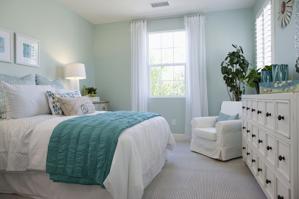
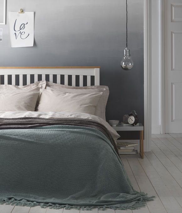
The Ambience:
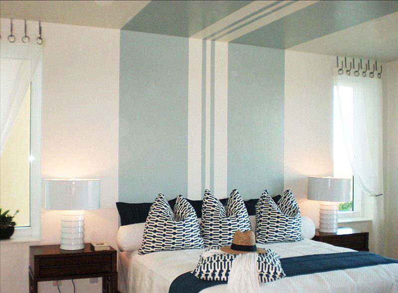
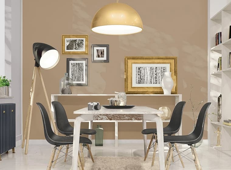
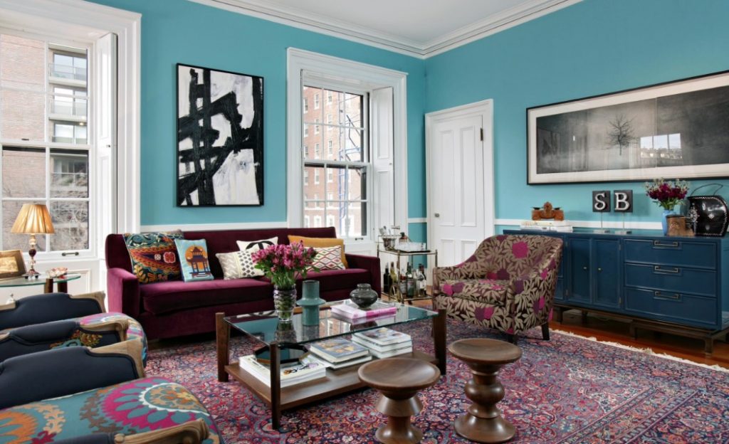
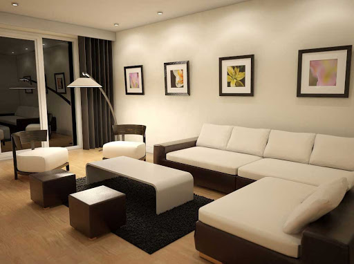
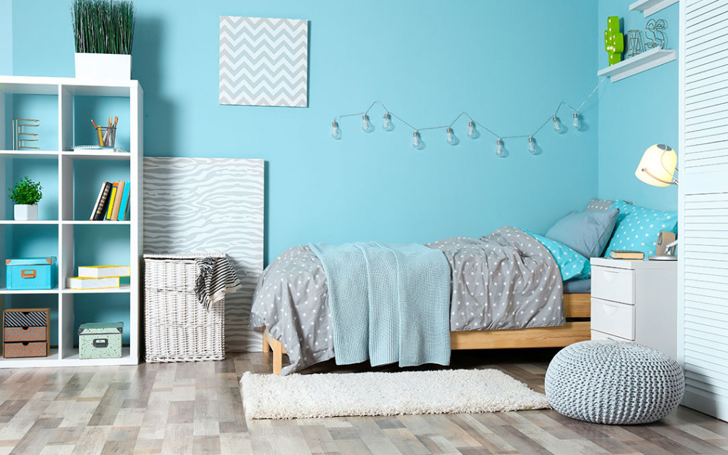
When picking a colour, consider the mood, or rather the ambience of the room you want to compliment. For example, in a bedroom, would you prefer the feeling of restfulness and soothing or dramatic and intimate. Soft cool colours and neutrals usually curate a quieter feeling while bold saturated colours are for drama and cherry on top. Go ahead, experiment; dining area, would you want to give it a sociable and stimulating ambience or formal and quiet appearance would do? Warmer, contrasting and brighter undertones add to a sociable atmosphere; deeper blue-green, and neutrals will give a more formal ambiance.
The Lights:
There’s a reason why paint store have light boxes for you to test paint chips because—
- natural daylight shows the truest colours;
- Incandescent lighting brings out warm tones and yellow hues;
- Fluorescent lighting casts a sharp blue tone.
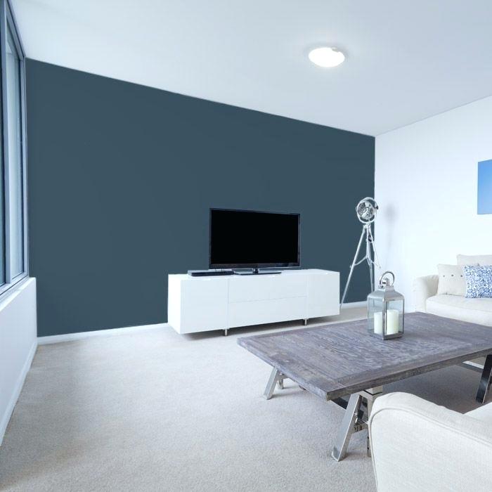
So, a strong saturated colour might be too bright for the eyes and overpowering when used on all walls or next to a large window perhaps. But it might be effective when used as an accent wall with indirect light.
Colour Terms:
It’s nothing wrong in learning the terms before jumping right into the rainbow. The terminology used to describe colours are underestimated, give it a nod —
- Hue is what we call a colour; red is the hue and so is rest of the palette.
- Saturation refers to how dominant the hue is; as we go from red to pink, the red hue becomes less dominant.
- Intensity is the brilliance of the colours; pure hues such as red are more intense than the combined colours such as yellow-green. A stronger intense colour usually has a more dominant hue.
If you want a more active space, consider introducing stronger saturated, intense colour. Even if you want a light-coloured room, choose hues that are slightly more saturated than off-white or light pastel. Very light colour can feel bright and dark when it appears on all surfaces in a room. However, two or more medium-light, closely related pastel colours can create a luminous effect when used in the same room.
Paint Finishes:
A single colour used on walls and trim takes on new significance when applied in different finishes. For example, wall and trim colours can remain the same hue, but use an eggshell (matte and less reflective) finish on walls and a satin or semigloss on trim. The colour will appear slightly different on each surface. It’s a good way to create a cohesive look in rooms with many windows and doors, and relatively little wall area.
Decorative Finishes:
You can transform flat, dull walls into interesting and personal spaces with subtle or dramatic visual texture and broken colour. Burnished mineral/metal finishes and layered coloured glazes add depth. Some examples of softly reflective metals are mica, copper, pewter, bronze and, of course, antiqued silver and gold.
The Colour Wheel:
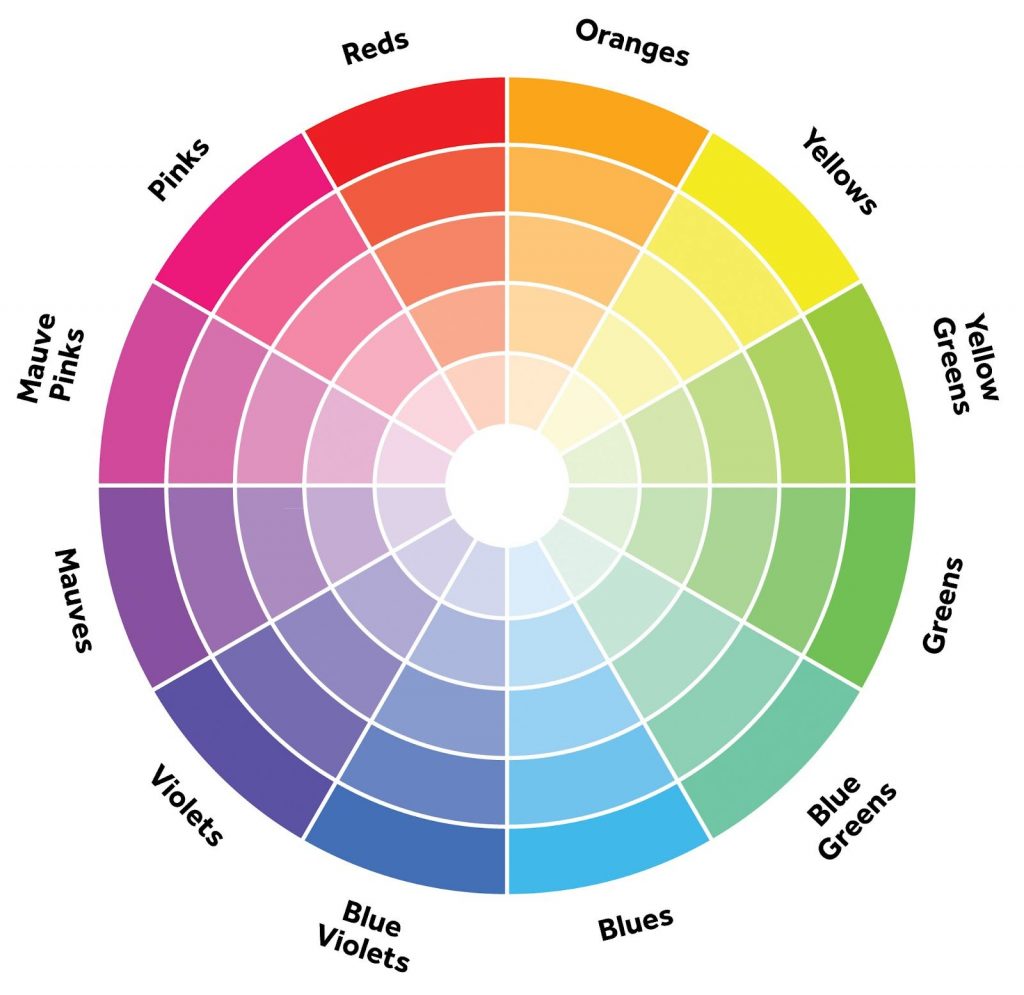
A small colour wheel is a great reference tool for modifying and intensifying two or more colours. For example, red and green, which are complementary (opposite) colours, are most intense when used together. You may be surprised at how many combinations function beautifully together, and you may even become attracted to entirely new colour palettes. The colour wheel also illustrates the visual temperature of a colour. Draw a line from the yellow-green mark on the colour wheel all the way down to the red-violet; you’ll see that all the colours on the left are warm and the colours on the right are cool.
Monochromatic Schemes:
If you think one colour is boring? Create bold or subtle variations within one colour group with contrasting paint finishes. For example, use closely related colours, or try a single colour in different finishes, for walls and trim in one space. For an accent colour, select a warmer (more toward reds) or cooler (more toward blues) colour to complement your main colour group. For a quieter ambience, make sure your colours are not extremely bright. White or an off-white tint can be a striking accent when used as trim with a monochromatic colour group.
And with this, we end our colourful decorative piece of article on paints! We hope that we’ve helped and answered your burning questions on paints and colours. Hopefully, this article will help you pick a better paint colours for your home and transform your living space into magic, or perhaps, likely turn it into drama.